pacman::p_load(ggstatsplot, ggthemes, plotly, corrplot, lubridate, ggpubr, plotly, treemap, d3treeR, hrbrthemes, ggrepel, RColorBrewer, gganimate, viridis, ggridges, ggrepel, testthat, hmisc, tidyverse)Is the Media Noise around Re-sale price (2022) right?
1. The Task
The task is to uncover the salient patterns of the resale prices of public housing property by residential towns and estates in Singapore by using appropriate analytical visualisation techniques learned in Lesson 4: Fundamentals of Visual Analytics. Students are encouraged to apply appropriate interactive techniques to enhance user and data discovery experiences.
For the purpose of this study, the focus should be on 3-ROOM, 4-ROOM and 5-ROOM types. You can choose to focus on either one housing type or multiple housing types. The study period should be on 2022.
2. Description of Dataset
The data used is ’Resale flat princes based on registration date from Jan-2017 onwards’, which was obtained from Data.gov.sg. The data has 147601 rows and 11 columns.
| Columns | Description |
|---|---|
| month | Month and year of listing |
| town | Planning area in Singapore |
| flat_type | Type of flats available - 1 room, 2 room, 3 room, etc |
| block | Block number of flat |
| street_name | Name of the street where the flat is located |
| storey_range | Range of storey |
| floor_area_sqm | The area of the flat in square metre |
| flat_model | Model of flat type - new generation, model A, etc |
| lease_commence_date | Year the lease started |
| remaining_lease | Number of years and months pending on lease lapse |
| resale_price | Total resale price of flat |
3. Data Wrangling and Preparation
3.1 Install Requisite R Packages
3.2 Loading the Resale Flat - Singapore Dataset
sg_re_price <- read_csv("data/resale_flat_prices.csv")3.3 Data Prep
| Issues | Description | Resolution |
|---|---|---|
| Outliers | The resale price has outliers where the price goes up 141800. The top 10% of resale price are outliers. | Outliers should be excluded from the data. Anything falling above the 3rd quartile is filtered out from the data. (3.3.4) |
| Variable type | Date is available in the form of ‘YYYY - MM’ which is not readable in R | Format date, seperate month into month and year. (3.3.1) |
| New variables | Lease start date and lease years cannot be used for analysis. Additionally, floor area and reslae price can be used to calculate price per square meter to enhance analysis. | price_psm, priceK and property age are calculated. (3.3.2) |
3.3.1. Separating the date into month and year
Code
sg_re_price <- sg_re_price %>%
  separate(month, c("Year", "Month"), sep = "-")
Code
sg_re_price$Year <- strtoi(sg_re_price$Year)
sg_re_price$Month <- strtoi(sg_re_price$Month)
3.3.2 Creating new variables
Code
sg_re_price <- sg_re_price %>%
  mutate(price_psm = round(resale_price / floor_area_sqm)) %>%
  mutate(priceK = round(resale_price / 1000)) %>%
  mutate(property_age = round(2022 - lease_commence_date))
3.3.3 Considering data for year 2022 and 3-room, 4-room and 5-room flat types
Code
sg_re_price_2022 <- sg_re_price %>%
  filter(Year == 2022, flat_type %in% c("3 ROOM", "4 ROOM", "5 ROOM"))
3.3.4 Summary of Data
The filtered data has 24, 372 observations. Please find below the summary statistics for each of the variables.
psych::describe(sg_re_price_2022) vars n mean sd median trimmed mad
Year 1 24372 2022.00 0.00 2022 2022.00 0.00
Month 2 19922 6.05 3.65 5 5.93 2.97
town* 3 24372 15.12 7.88 17 15.47 8.90
flat_type* 4 24372 2.02 0.73 2 2.02 1.48
block* 5 24372 1059.67 706.08 1018 1035.46 886.59
street_name* 6 24372 275.03 165.99 275 274.60 212.01
storey_range* 7 24372 3.36 2.09 3 3.08 1.48
floor_area_sqm 8 24372 94.08 19.32 93 93.99 25.20
flat_model* 9 24372 6.78 2.63 6 6.52 2.97
lease_commence_date 10 24372 1997.46 14.98 1998 1997.83 20.76
remaining_lease* 11 24372 376.27 180.22 377 380.97 247.59
resale_price 12 24372 536394.11 157999.71 515000 520463.70 133434.00
price_psm 13 24372 5735.91 1363.09 5368 5511.74 913.28
priceK 14 24372 536.40 158.00 515 520.47 133.43
property_age 15 24372 24.54 14.98 24 24.17 20.76
min max range skew kurtosis se
Year 2022 2022 0 NaN NaN 0.00
Month 1 12 11 0.31 -1.21 0.03
town* 1 26 25 -0.31 -1.16 0.05
flat_type* 1 3 2 -0.02 -1.13 0.00
block* 1 2457 2456 0.21 -1.16 4.52
street_name* 1 552 551 0.02 -1.26 1.06
storey_range* 1 17 16 1.66 4.36 0.01
floor_area_sqm 51 159 108 -0.06 -0.85 0.12
flat_model* 1 16 15 0.71 -0.39 0.02
lease_commence_date 1967 2019 52 -0.03 -1.33 0.10
remaining_lease* 1 638 637 -0.04 -1.32 1.15
resale_price 200000 1418000 1218000 1.09 1.81 1012.07
price_psm 3333 14731 11398 1.70 3.30 8.73
priceK 200 1418 1218 1.09 1.81 1.01
property_age 3 55 52 0.03 -1.33 0.103.3.5. Historgram and dealing with outliers
To check the normality of data, we chart out histograms for resale price (in 1000s), Floor area, Property age and price per square meter. We observe that there is a distinct right skew for price per square and resale price ((in 1000s). Our aim is for the data to be normal or as normal as possible.
Code
set.seed(1234)

#need to change bar colors, line color, ggtitles, gglabs

p1 <- gghistostats(
  data = sg_re_price_2022,
  x = priceK,
  type = "bayes",
  test.value = 60,
  xlab = "Resale Price in Thousands") +

  theme_minimal() +

  theme(text = element_text(family = "Garamond"))

p2 <- gghistostats(
  data = sg_re_price_2022,
  x = floor_area_sqm,
  type = "bayes",
  test.value = 60,
  xlab = "Floor area (sqm)"
) +
  theme_minimal() +

  theme(text = element_text(family = "Garamond"))

p3 <- gghistostats(
  data = sg_re_price_2022,
  x = property_age,
  type = "bayes",
  test.value = 60,
  xlab = "Property Age"
) +
  theme_minimal() +

  theme(text = element_text(family = "Garamond"))

p4 <- gghistostats(
  data = sg_re_price_2022,
  x = price_psm,
  type = "bayes",
  test.value = 60,
  xlab = "Resale price psm"
) +
  theme_minimal()+

  theme(text = element_text(family = "Garamond"))
3. Remove outliers: The rule of thumb for outliers is that data points over the third quartile are eliminated. We calculate the upper limit and interquartile range for both the variables and then filter out the outliers.
Code
# Calculating the upper limit and Interquartile range for Price in 1000s and price per square meter

IQR_priceK = IQR(sg_re_price_2022$priceK)
IQR_price_psm = IQR(sg_re_price_2022$price_psm)

priceK_upper = quantile(sg_re_price_2022$priceK,probs = 0.9)+1.5*IQR_priceK
price_psm_upper = quantile(sg_re_price_2022$price_psm,probs = 0.9)+1.5*IQR_price_psm

# Filtering out the outliers
sg_re_price_2022_v1 <- sg_re_price_2022 %>%
           filter ((priceK <= priceK_upper) &
           (price_psm<= price_psm_upper))
4. View data after outliers are removed
Code
#To plot normality, we need to ascertain the mean and std. deviation

mean_priceK = mean(sg_re_price_2022_v1$priceK)
std_priceK = sd(sg_re_price_2022_v1$priceK)

priceK_norm <- ggplot(sg_re_price_2022_v1, aes(priceK))+
  geom_histogram(aes(y=..density..), fill = '#133337', color = '#eeeeee')+

  stat_function(fun = dnorm, args = list(mean = mean_priceK, sd = std_priceK), col="#66cccc", size = .7)+

  labs(title = 'Normality Check on Distribution of Resale Price',
       x = "Resale price in Thousands (SGD)")+

  theme_minimal()+

  theme(text = element_text(family = "Garamond"),
        plot.title = element_text(hjust = 0.1, size = 10, face = 'bold'),
        plot.margin = margin(20, 20, 20, 20),

        panel.background = element_rect(fill = 'white'),
        panel.grid.major.x = element_line(linewidth = 0.25, linetype = 'dashed', colour = '#bebebe'),
        panel.grid.major.y = element_blank(),
        panel.grid.minor.x = element_blank(),
        panel.grid.minor.y = element_blank(),


        axis.text.y = element_blank(),
        axis.title.y = element_blank(),
        axis.ticks.y = element_blank(),
        axis.text.x = element_text(size = 8, face = "bold"),
        axis.title.x = element_text(hjust = 0.4, size = 10, face = "bold"))
Code
#To plot normality, we need to ascertain the mean and std. deviation

mean_price_psm = mean(sg_re_price_2022_v1$price_psm)
std_price_psm = sd(sg_re_price_2022_v1$price_psm)

price_per_psm_norm <- ggplot(sg_re_price_2022_v1, aes(price_psm))+
  geom_histogram(aes(y=..density..), fill = '#133337', color = '#eeeeee')+
  stat_function(fun = dnorm, args = list(mean = mean_price_psm, sd = std_price_psm), col="#66cccc", size = .7)+

  labs(title = 'Normality Check on Distribution of Resale Price psm',
       x = "Resale price per sqm (SGD)",
       caption = "Source: Data.gov.sg")+

  theme_minimal()+

  theme(text = element_text(family = "Garamond"),
        plot.title = element_text(hjust = 0.1, size = 10, face = 'bold'),
        plot.margin = margin(20, 20, 20, 20),
        plot.caption = element_text(face = "italic", size = 10),

        panel.background = element_rect(fill = 'white'),
        panel.grid.major.x = element_line(linewidth = 0.25, linetype = 'dashed', colour = '#bebebe'),
        panel.grid.major.y = element_blank(),
        panel.grid.minor.x = element_blank(),
        panel.grid.minor.y = element_blank(),


        axis.text.y = element_blank(),
        axis.title.y = element_blank(),
        axis.ticks.y = element_blank(),
        axis.text.x = element_text(size = 8, face = "bold"),
        axis.title.x = element_text(hjust = 0.5, size = 10, face = "bold"))
Code
priceK_norm + price_per_psm_norm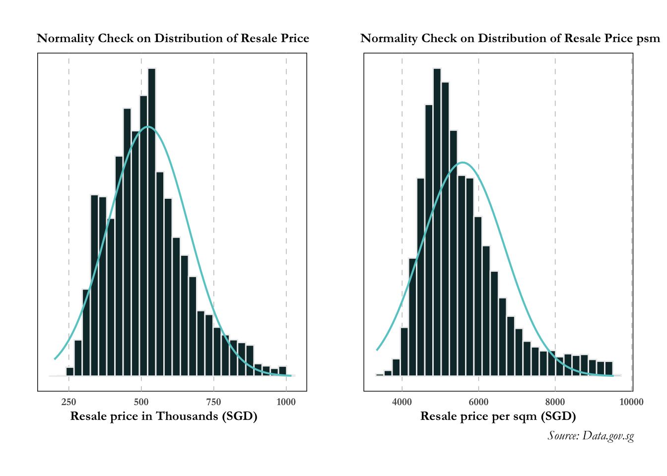
The distribution for resale price and resale price psm appears to be less right skewed post removing outliers!
4. Data Visualisation
4.1 Flat Type
4.1.1 Resale prices over the years by flat type
Ridgeline plot is a set of overlapped density plots, and it helps us to compare multiple distirbutions among dataset. They are useful for visualizing changes in distributions over time or space.
From this graph we learn:
- The resale prices are more or less contained from 2017 to 2020. There is a marked increase (sharp right movement of all curves) in prices for all flat types in 2020, then a gradual increase is observed from 2021.
- There is a slow increase in prices observed over 2022. The distribution of 5-room flats observes rapid fluctuations in the first quarter of the year. 3-room flats has an even distribution throughout and 4-room flats observe minor fluctuations over 2022.
Code
sg_re_price_flat <- sg_re_price %>%
  filter(flat_type %in% c("3 ROOM", "4 ROOM", "5 ROOM"))

ggplot(data = sg_re_price_flat, aes(x = priceK, y = flat_type, fill = after_stat(x))) +

  geom_density_ridges_gradient(scale = 3, rel_min_height = 0.01) +

  theme_minimal() +

    labs(title = 'Resale Prices by Flat Type: {frame_time}',
       y = "Resale Price in Thousands (SGD)",
       x = "Flat Type") +

  theme(legend.position="none",
  text = element_text(family = "Garamond"),
  plot.title = element_text(face = "bold", size = 12),

  axis.title.x = element_text(size = 10, hjust = 1),
  axis.title.y = element_text(size = 10),
  axis.text = element_text(size = 8)) +

  scale_fill_viridis(name = "priceK", option = "D") +

  transition_time(sg_re_price_flat$Year) +
  ease_aes('linear')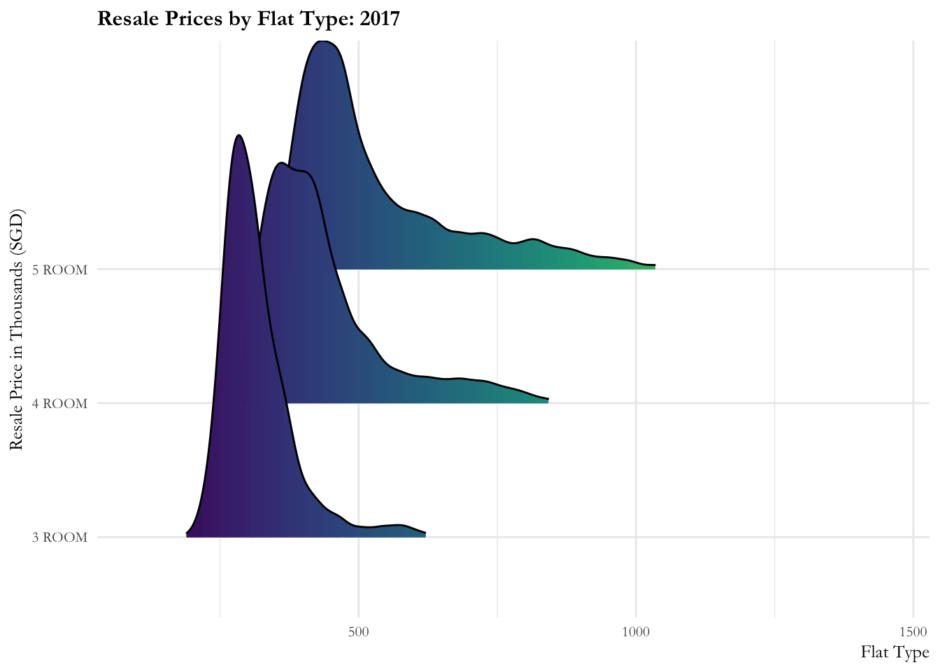
Code
ggplot(data = sg_re_price_2022_v1, aes(x = priceK, y = flat_type, fill = after_stat(x))) +

  geom_density_ridges_gradient(scale = 3, rel_min_height = 0.01) +

  theme_minimal() +

    labs(title = 'Resale Prices by Flat Type in 2022, Month: {frame_time}',
       x = "Flat Type",
       y = "Resale Price in Thousands (SGD)") +

  theme(legend.position="none",
  text = element_text(family = "Garamond"),
  plot.title = element_text(face = "bold", size = 12),

  axis.title.x = element_text(size = 10, hjust = 1),
  axis.title.y = element_text(size = 10),
  axis.text = element_text(size = 8)) +

  scale_fill_viridis(name = "priceK", option = "D") +

  transition_time(sg_re_price_2022_v1$Month) +
  ease_aes('linear')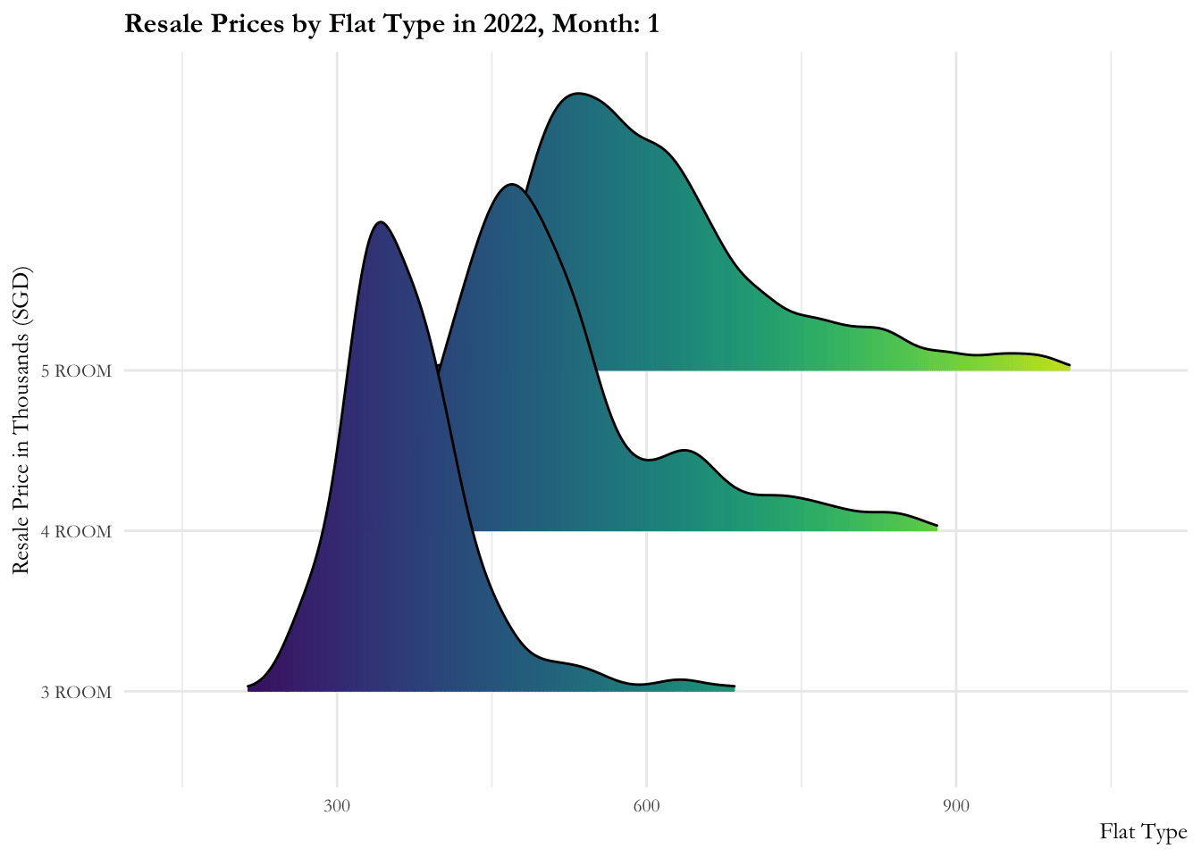
4.1.2 Proportion of flat types in Singapore
The data clearly shows that 4-room apartments are the most popular in Singapore, accounting for nearly 50% of the flat types. 5-room and 3-rooms have relatively the same proportion of flats in Singapore - accounting for a quarter of each!
Code
HDB_count  <- sg_re_price_2022_v1 %>%
  group_by(flat_type) %>%
  summarize(
    count = n()) %>%
  mutate(hdb_pie_pct = round(count/sum(count)*100)) %>%
  mutate(ypos_p = rev(cumsum(rev(hdb_pie_pct))),
         pos_p = hdb_pie_pct/2 + lead(ypos_p,1),
         pos_p = if_else(is.na(pos_p), hdb_pie_pct/2, pos_p))

ggplot(HDB_count, aes(x = "" , y = hdb_pie_pct, fill = fct_inorder(flat_type))) +
  geom_col(width = 1, color = 1) +
  coord_polar(theta = "y") +
  scale_fill_brewer(palette = "YlGnBu") +
  geom_label_repel(data = HDB_count,
                   aes(y = pos_p, label = paste0(hdb_pie_pct, "%")),
                   size = 4.5, nudge_x = 1, color = c(1, 1, 1), show.legend = FALSE) +
  guides(fill = guide_legend(title = "Flat Type")) +
  labs(title = "Proportion of Flat Types in Singapore")+
theme(legend.position = "bottom")+
theme_minimal()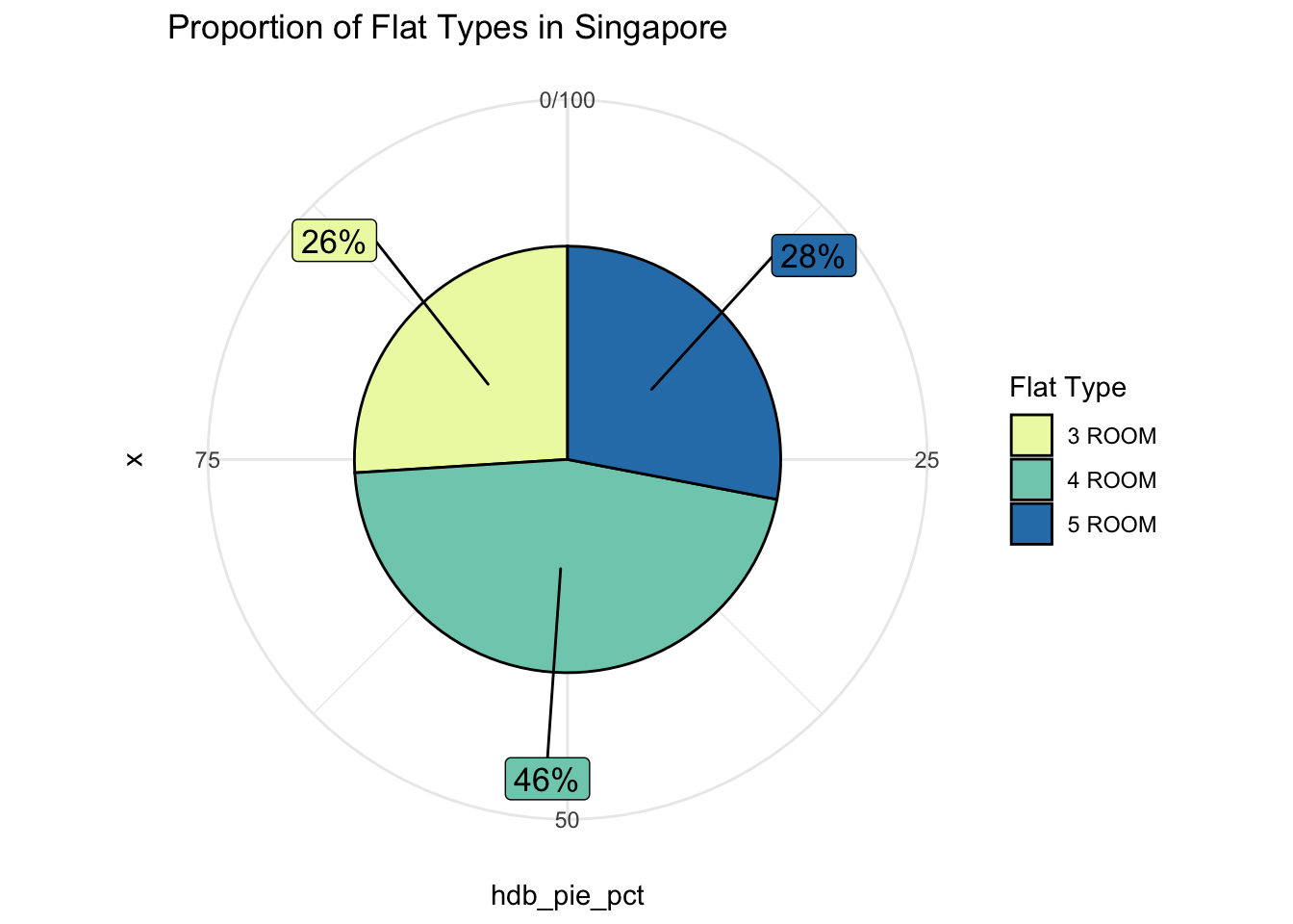
4.1.3 Boxplot of Resale price by flat types
In descriptive statistics, a box plot or boxplot is a type of chart often used for EDA. Box plots visually show the distribution of numerical data and skewness through displaying the data quartiles (or percentiles) and averages.
When the median line appears in the middle of the boxplot, the data is normally distributed. We observe that:
- As expected, the median is the highest for 5-room flats, followed by 4-room and lastly 3-room flats.
- The dispersion (interquartile range) is the smallest for 3-room flats and largest for 5 room flats. This suggests that the 3 room flats are spread out around the median in comparison to 4 or 5 room flats.
- There is higher presence of outliers for 3-room flats, some even going up to 930000 (3rd quartile for 5-room flat)
Code
t <- list(
  family = "Garamond",
  size = 19,
  face = "bold")

t1 <- list(
  family = "Garamond",
  size = 15,
  face = "bold")

fig <- plot_ly(
  data = sg_re_price_2022_v1,
  y = ~priceK,
  type = "box",
  color = ~flat_type,
  colors = "YlGnBu",
  showlegend = FALSE,
  boxmean = TRUE
) %>%
  layout(title= list(text = "Boxplot of resale price in Thousands by flat type",font = t1),
         xaxis = list(title = list(text ='Flat Type', font = t1)),
         yaxis = list(title = list(text ='Resale Price in Thousands (SGD)', font = t1)))

fig
4.1.4 Is there an increase in resale price monthly by flat type?
Media outlets have been reporting that there has been a dramatic increase in the resale prices for HDBs. Real estate data is known to have many outliers, hence the best metric for comparison over time and distribution is median (they are unaffected by outliers). In the graph below, we observe that there is no discernible difference in the median prices, monthly, for 3 room, 4 room, 5 room flats,
Code
ggplot(na.omit(sg_re_price_2022_v1),aes(x = flat_type, y = priceK)) +

  geom_boxplot(aes(fill = as.factor(Month)), color = "#c0c0c0") +

  stat_summary(fun.y = "mean", geom = "point", color = "black") +

  theme_minimal() +

  scale_fill_brewer(palette = "Paired") +

 labs( title = "Monthly Resale prices by Flat Types",
       y = "Resale price (1000s)",
       x = "Flat Type",
       fill = "Month") +

theme(text = element_text(family = "Garamond"),
        plot.title = element_text(hjust = 0.5, size = 12, face = 'bold'),
        plot.margin = margin(20, 20, 20, 20),
        legend.position = "bottom",

        axis.text = element_text(size = 10, face = "bold"),
        axis.title.x = element_text(hjust = 0.5, size = 12, face = "bold"),
        axis.title.y = element_text(hjust = 0.5, size = 12, face = "bold"))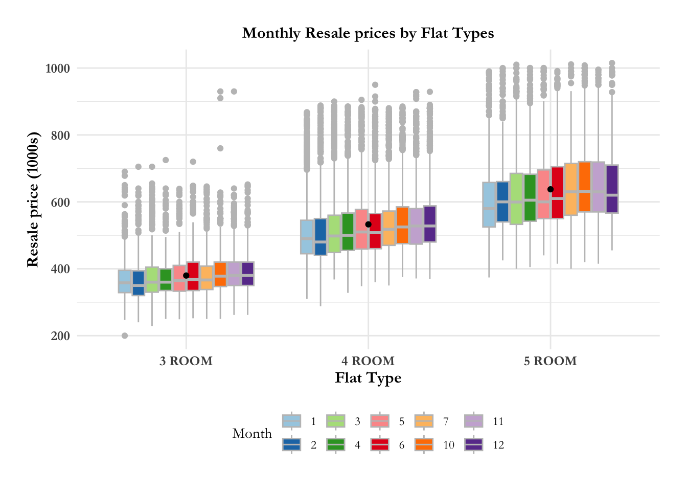
Code
na.omit(sg_re_price_2022_v1) %>%
  filter(flat_type == "3 ROOM") %>%
  ggplot(aes(x = flat_type, y = priceK)) +

  geom_boxplot(aes(fill = as.factor(Month)), color = "#c0c0c0") +

  stat_summary(fun.y = "mean", geom = "point", color = "black") +

  theme_minimal() +

  scale_fill_brewer(palette = "Paired") +

 labs( title = "Monthly Resale prices by Flat Types",
       y = "Resale price (1000s)",
       x = "Flat Type",
       fill = "Month") +

theme(text = element_text(family = "Garamond"),
        plot.title = element_text(hjust = 0.5, size = 12, face = 'bold'),
        plot.margin = margin(20, 20, 20, 20),
        legend.position = "bottom",

        axis.text = element_text(size = 10, face = "bold"),
        axis.title.x = element_text(hjust = 0.5, size = 12, face = "bold"),
        axis.title.y = element_text(hjust = 0.5, size = 12, face = "bold"))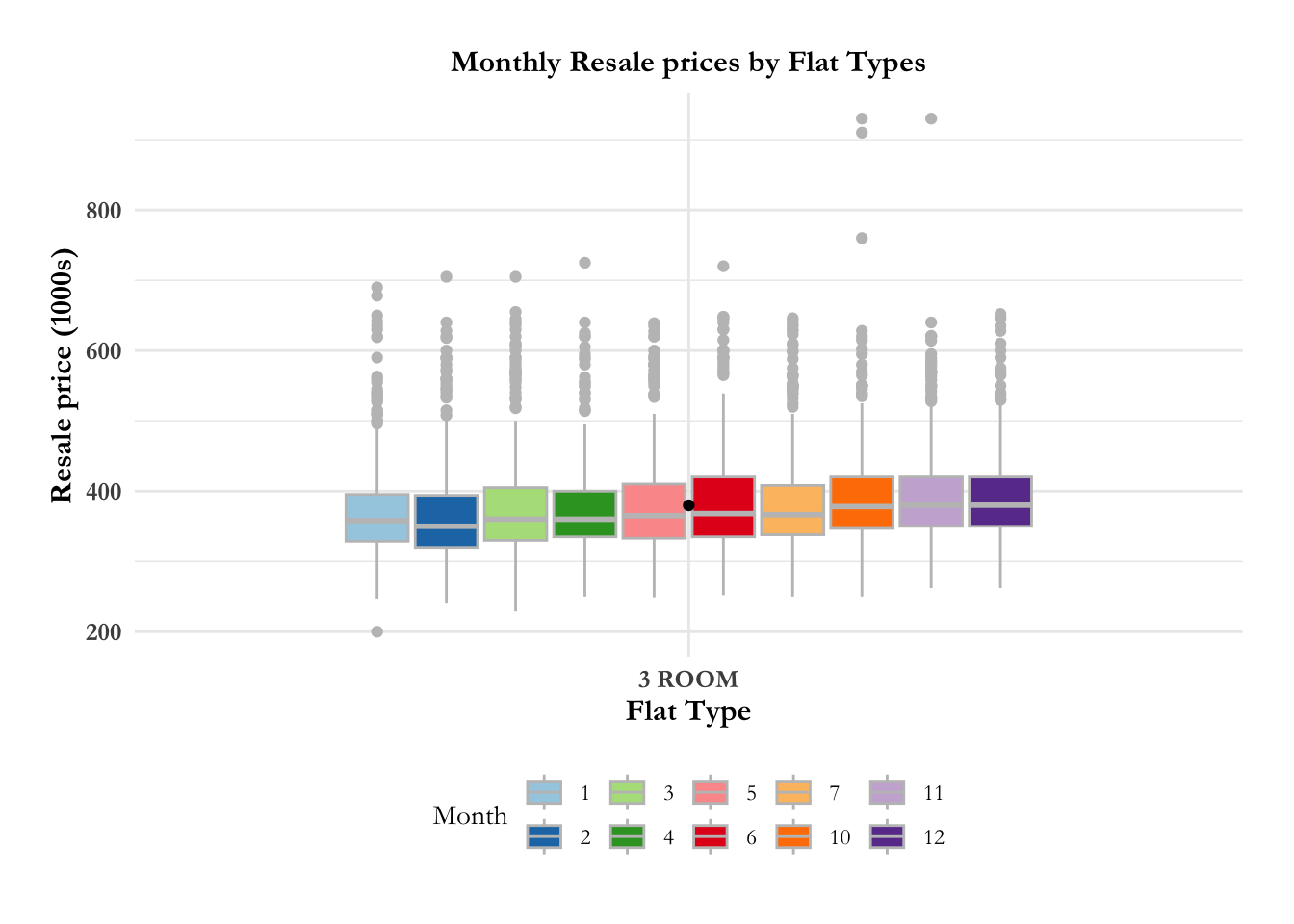
Code
na.omit(sg_re_price_2022_v1) %>%
  filter(flat_type == "4 ROOM") %>%
  ggplot(aes(x = flat_type, y = priceK)) +

  geom_boxplot(aes(fill = as.factor(Month)), color = "#c0c0c0") +

  stat_summary(fun.y = "mean", geom = "point", color = "black") +

  theme_minimal() +

  scale_fill_brewer(palette = "Paired") +

 labs( title = "Monthly Resale prices by Flat Types",
       y = "Resale price (1000s)",
       x = "Flat Type",
       fill = "Month") +

theme(text = element_text(family = "Garamond"),
        plot.title = element_text(hjust = 0.5, size = 12, face = 'bold'),
        plot.margin = margin(20, 20, 20, 20),
        legend.position = "bottom",

        axis.text = element_text(size = 10, face = "bold"),
        axis.title.x = element_text(hjust = 0.5, size = 12, face = "bold"),
        axis.title.y = element_text(hjust = 0.5, size = 12, face = "bold"))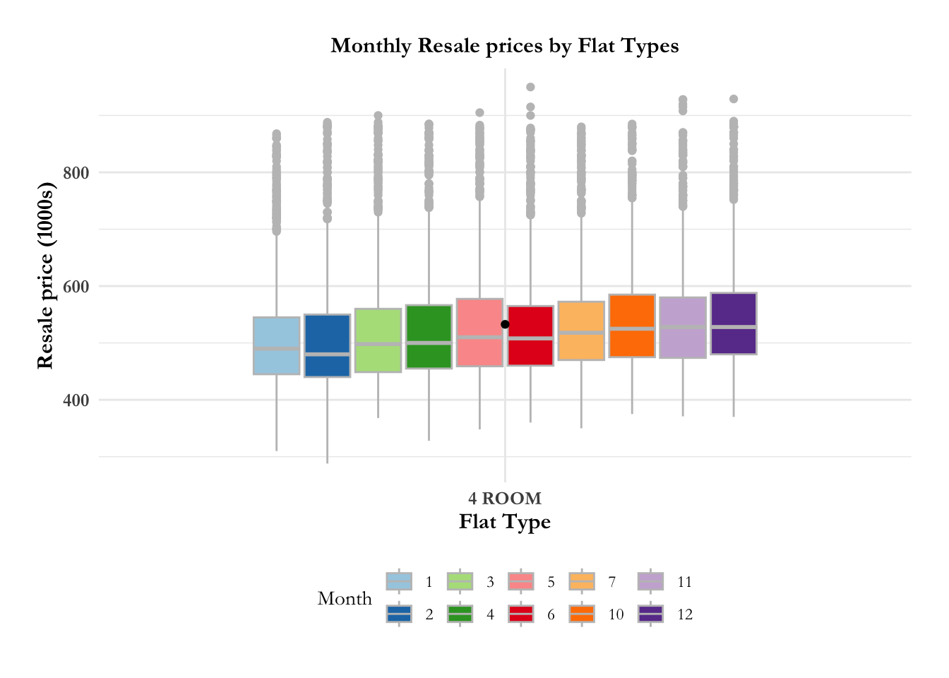
Code
na.omit(sg_re_price_2022_v1) %>%
  filter(flat_type == "5 ROOM") %>%
  ggplot(aes(x = flat_type, y = priceK)) +

  geom_boxplot(aes(fill = as.factor(Month)), color = "#c0c0c0") +

  stat_summary(fun.y = "mean", geom = "point", color = "black") +

  theme_minimal() +

  scale_fill_brewer(palette = "Paired") +

 labs( title = "Monthly Resale prices by Flat Types",
       y = "Resale price (1000s)",
       x = "Flat Type",
       fill = "Month") +

theme(text = element_text(family = "Garamond"),
        plot.title = element_text(hjust = 0.5, size = 12, face = 'bold'),
        plot.margin = margin(20, 20, 20, 20),
        legend.position = "bottom",

        axis.text = element_text(size = 10, face = "bold"),
        axis.title.x = element_text(hjust = 0.5, size = 12, face = "bold"),
        axis.title.y = element_text(hjust = 0.5, size = 12, face = "bold"))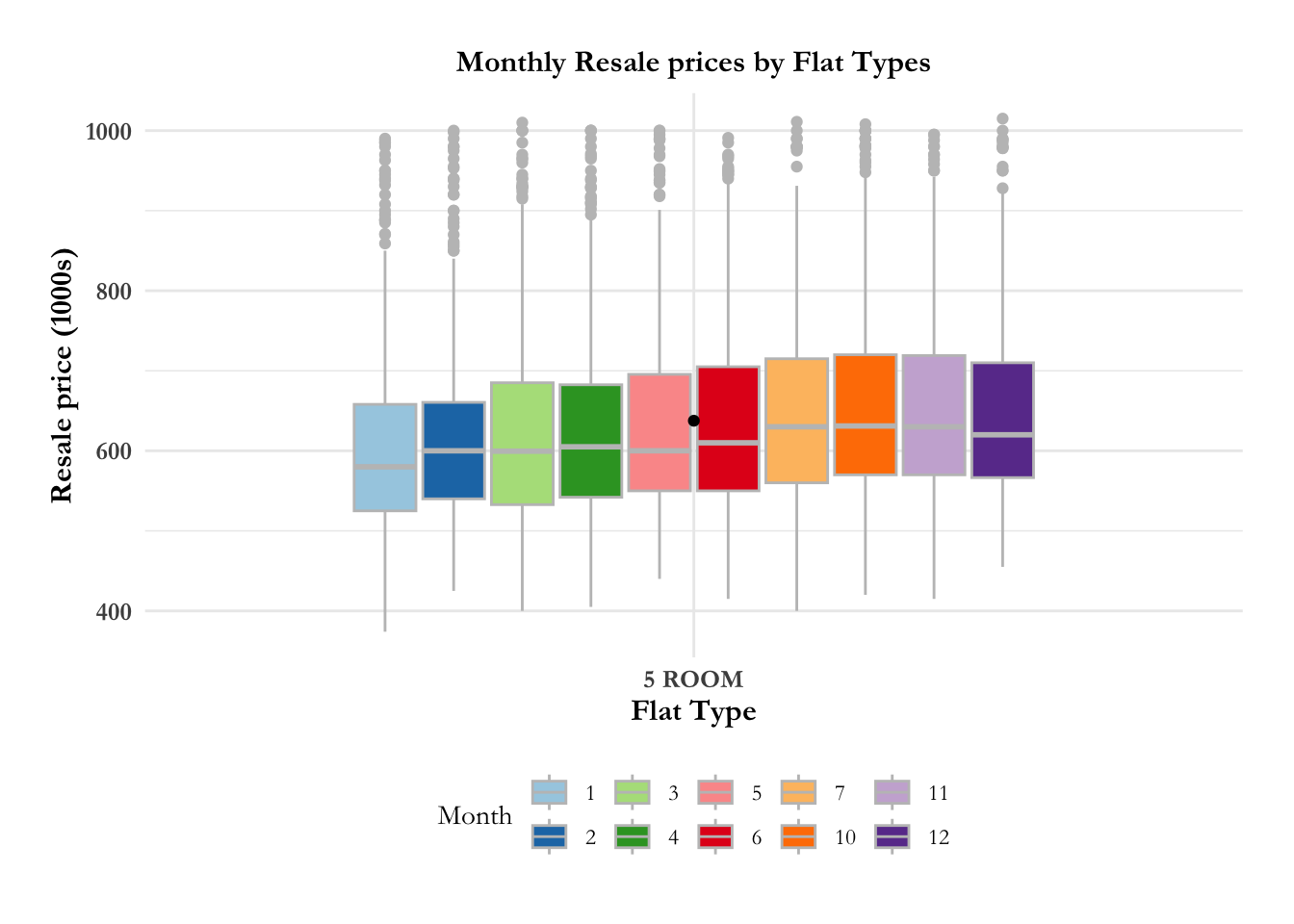
4.2 Planning Area
4.2.1 Resale price by planning area over time
The ridge plot showcases:
- The resale prices across planning areas are more or less contained from 2017 to 2020. There is a marked increase (sharp right movement of all curves) in prices for all planning areas in 2020, then a gradual increase is observed from 2021.
- The distribution across planning areas is more or less constant till 2020. Post 2020, most of the distributions are flattening out indicating that the prices are widely distributed over these time periods. Bukit Timah, Central Area, Queenstown have 2 - 3 humps in their distribution implying that they have properties in the lower, medium and upper range.
Code
ggplot(data = sg_re_price, aes(x = priceK, y = town, fill = after_stat(x))) +

  geom_density_ridges_gradient(scale = 3, rel_min_height = 0.01) +

  theme_minimal() +

  labs(title = 'Resale Prices by Planning Area: {frame_time}') +
  transition_time(sg_re_price$Year) +

  theme(legend.position="none",
  text = element_text(family = "Garamond"),
  plot.title = element_text(face = "bold", size = 12),

  axis.title.x = element_text(size = 10, hjust = 1),
  axis.title.y = element_text(size = 10, angle = 360),
  axis.text = element_text(size = 8)) +

  scale_fill_viridis(name = "priceK", option = "D") +

  ease_aes('linear')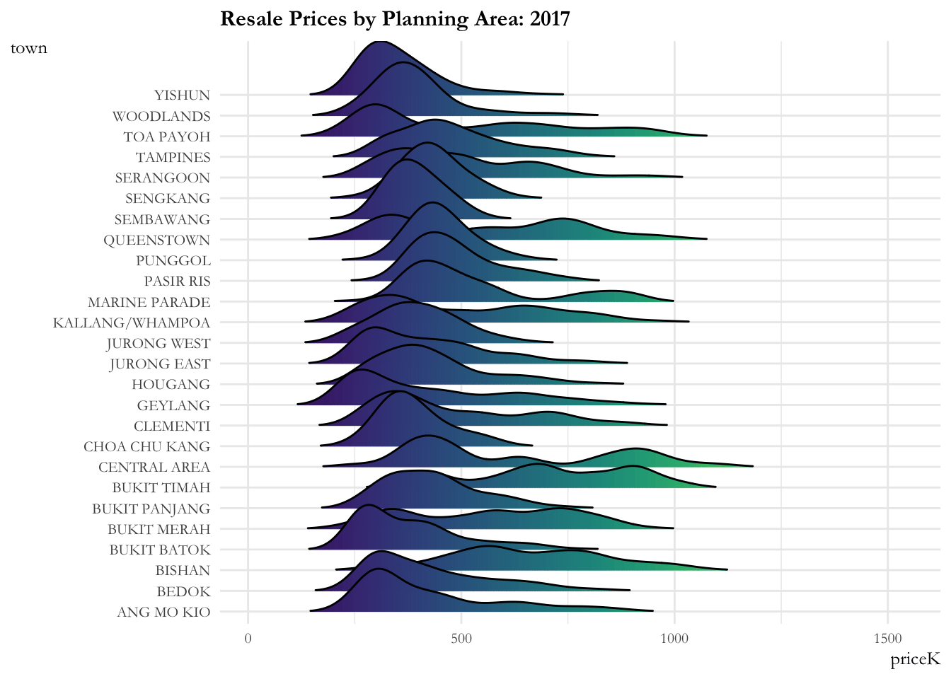
Code
ggplot(data = sg_re_price_2022_v1, aes(x = priceK, y = town, fill = after_stat(x))) +

  geom_density_ridges_gradient(scale = 3, rel_min_height = 0.01) +

  theme_minimal() +

  labs(title = 'Resale Prices by Planning Area in 2022, Month: {frame_time}') +

  theme(legend.position="none",
  text = element_text(family = "Garamond"),
  plot.title = element_text(face = "bold", size = 12),

  axis.title.x = element_text(size = 10, hjust = 1),
  axis.title.y = element_text(size = 10, angle = 360),
  axis.text = element_text(size = 8)) +

  scale_fill_viridis(name = "priceK", option = "D") +

  transition_time(sg_re_price_2022_v1$Month) +
  ease_aes('linear')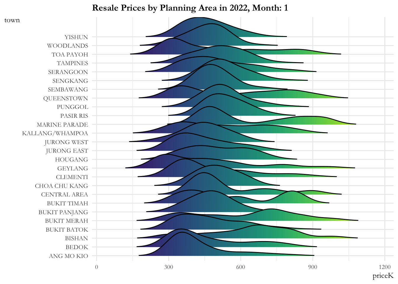
4.3 Flat type comparison by planning area
4.3.1 Proportion of Flat types by Planning area in Singapore
We now look into the proportion of flat types by planning areas. We observe that:
- Toa Payoh, Ang Mo Kio, Bedok, Central Area have the highest proprtion of 3-room flats, whereas Bukit Timah and Paris Ris have the least.
- Yishun, Woodlands, Serangoon have the highest proportion of 4-room flats.
- Sengkang, Punggol have the highest proportion of 5-room flats.
Code
prop_sg <- sg_re_price_2022_v1%>%
group_by(town, flat_type) %>%
summarize(ft_count = n())%>%
mutate(ft_pct = scales::percent(ft_count/sum(ft_count)))

prop <- ggplot(prop_sg,
                aes(town, ft_count, fill = flat_type)) +
  geom_bar(stat="identity") +

  labs(title = "Proportion of Flat types by Planning area in Singapore", x = "Planning Area", y = "Count", fill = "Flat Type") +

  theme_minimal() +

  scale_fill_viridis(discrete = T, option = "E") +

  theme(text = element_text(family = "Garamond"),
        plot.title = element_text(hjust = 0.4, size = 15, face = 'bold'),
        plot.margin = margin(20, 20, 20, 20),
        legend.position = "bottom",
        axis.text = element_text(size = 8, face = "bold"),
        axis.text.x = element_text(angle = 90, vjust = 0.5, hjust=1),
        axis.title.x = element_text(hjust = 0.5, size = 12, face = "bold"),
        axis.title.y = element_text(hjust = 0.5, size = 12, face = "bold"))

ggplotly(prop)
Code
prop_sg <- sg_re_price_2022_v1%>%
group_by(town, flat_type) %>%
summarize(ft_count = n())%>%
mutate(ft_pct = scales::percent(ft_count/sum(ft_count)))

prop_sg
# A tibble: 78 × 4
# Groups: town [26]
town flat_type ft_count ft_pct
<chr> <chr> <int> <chr>
1 ANG MO KIO 3 ROOM 524 56%
2 ANG MO KIO 4 ROOM 287 30%
3 ANG MO KIO 5 ROOM 132 14%
4 BEDOK 3 ROOM 555 43.7%
5 BEDOK 4 ROOM 462 36.4%
6 BEDOK 5 ROOM 253 19.9%
7 BISHAN 3 ROOM 65 17%
8 BISHAN 4 ROOM 200 51%
9 BISHAN 5 ROOM 124 32%
10 BUKIT BATOK 3 ROOM 281 35%
# … with 68 more rows4.3.2 Resale prices of different flat types by planning area
The dumbell chart showcases the minimum and maximum prices for each planning area.
- Woodlands, Sembawang, Choa Chu Kang provide more affordable flats with their maximum price being below SGD 800,000. Conversely, most of the other regions have wider distribution of prices ranging from mid to exorbitant.
Code
areas = unique(sg_re_price_2022_v1$town)
PA = c()
min_price = c()
max_price = c()

for(area in areas){
  df <- sg_re_price_2022_v1[sg_re_price_2022_v1$town == area,]
  PA = c(PA, area)
  min_price = c(min_price, min(df$priceK))
  max_price = c(max_price, max(df$priceK))
}

df <- data.frame("Planning_Area" = PA, "Min_Price" = min_price, "Max_Price" = max_price, check.names=FALSE)
Code
dumbell <- plot_ly(df) %>%
 add_segments(x = ~Min_Price, xend = ~Max_Price, y = ~Planning_Area, yend = ~Planning_Area, showlegend = FALSE) %>%
 add_markers(x = ~Min_Price, y = ~Planning_Area, name = "Min", color = I("#e66819")) %>%
 add_markers(x = ~Max_Price, y = ~Planning_Area, name = "Max", color = I("#bf0d31")) %>%
 layout(
    title = "Resale Price in 1000s Difference Across Planning Areas",
    xaxis = list(title = "Resale Price in 1000s (SGD)"),
    yaxis = list(title = "Planning Area"),
    margin = list(l = 70)
  )

dumbell
The dumbell chart is a parochial view of the range of resale price. Hence, we further delve into the box and whiskers plot of 3-room, 4-room, and 5-room flat types across the planning regions.
We see that areas such as Jurong West and Tampines have the widest price range for 5-room type flats, especially towards the lucrative side of the price. In Marine Parade, the 5-room flat types were significantly higher priced than 3-room and 4-room type flats. The opposite was true for areas such as Serangoon.
Code
#have to change theme and everything else

p <- ggplot(data = sg_re_price_2022_v1, aes(x = town, y = priceK)) +

  geom_boxplot(aes(fill = as.factor(flat_type))) +

  theme_minimal() +

  scale_fill_brewer(palette = "Dark2") +

 labs( title = "Resale prices in Thousands in 2022 by planning area",
       fill = "Flat Type",
       y = "Resale price (1000s)",
       x = "Planning Area") +

theme(text = element_text(family = "Garamond"),
        plot.title = element_text(hjust = 0.2, size = 12, face = 'bold'),
        plot.margin = margin(20, 20, 20, 20),
        legend.position = "bottom",

        axis.text = element_text(size = 8, face = "bold"),
        axis.text.x = element_text(angle = 90, vjust = 0.5, hjust=1),
        axis.title.x = element_text(hjust = 0.5, size = 12, face = "bold", color = "#899499"),
        axis.title.y = element_text(hjust = 0.5, size = 12, face = "bold", color = "#899499"))

ggplotly(p)
4.2 Area & Age by Flat Type
4.2.1 Correlation for Area, Age with Resale Price
The correlation chart shows that there is a positive relationship between area of property and resale price i.e. larger the property size gets, higher the resale price. Resale price and age have a weak negative relationship.
Code
ggscatterstats(
 data = sg_re_price_2022_v1,
x = floor_area_sqm,
y = priceK,
marginal = FALSE) +

  theme_minimal() +

  labs(title = 'Correlation of resale price (in 000s) and floor area (sqm)', x = "Floor Area", y = "Resale Price in 000s") +

theme(text = element_text(family = "Garamond"),
        plot.title = element_text(hjust = 0.2, size = 15, face = 'bold'),
        plot.margin = margin(20, 20, 20, 20),
        legend.position = "bottom",

        axis.text = element_text(size = 10, face = "bold"),
        axis.title = element_text(size = 12, face = "bold"))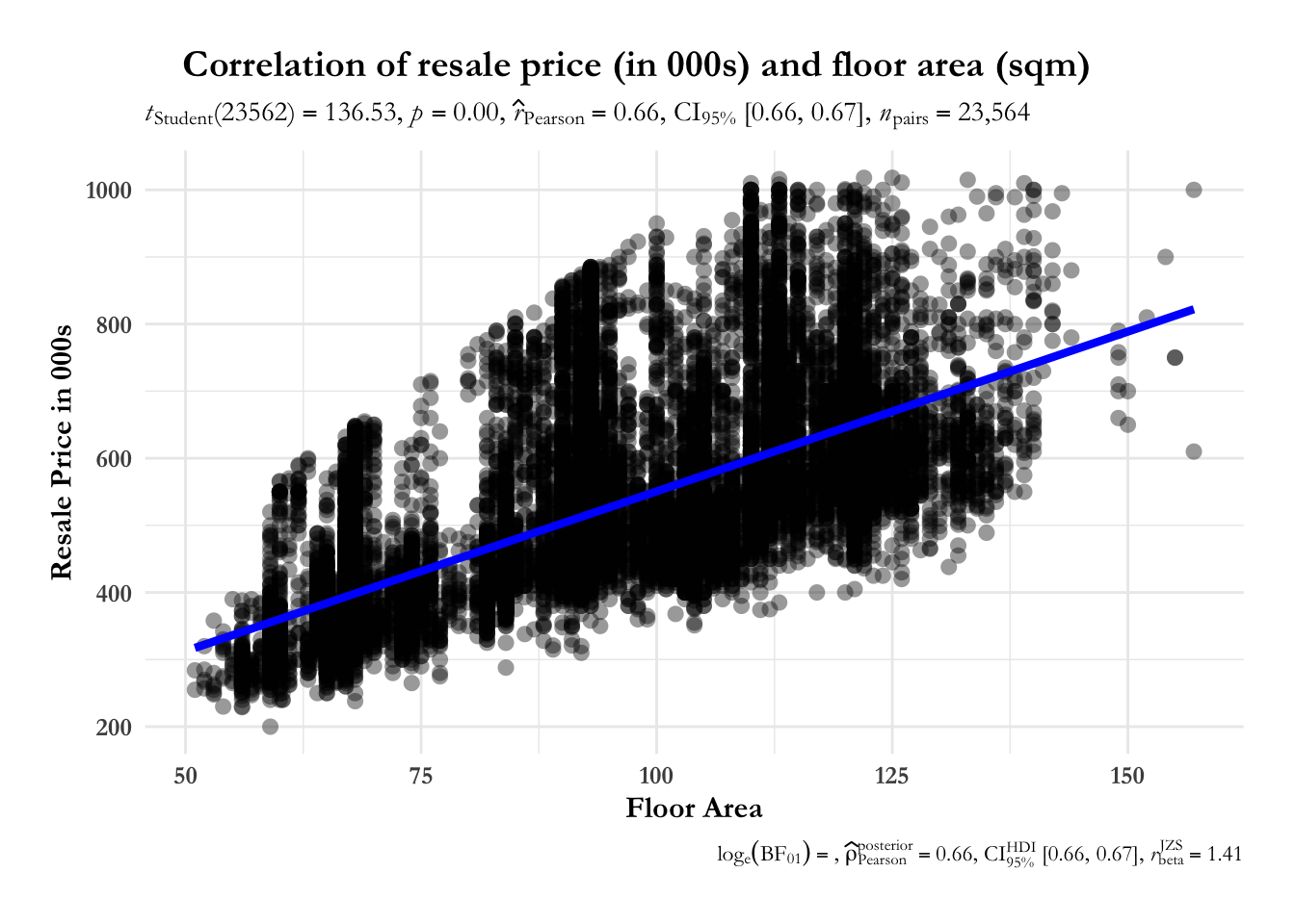
Code
ggscatterstats(
 data = sg_re_price_2022_v1,
x = property_age,
y = priceK,
marginal = FALSE) +

  theme_minimal() +

  labs(title = 'Correlation of resale price (in 000s) and floor area (sqm)', x = "Floor Area", y = "Resale Price in 000s") +

theme(text = element_text(family = "Garamond"),
        plot.title = element_text(hjust = 0.2, size = 15, face = 'bold'),
        plot.margin = margin(20, 20, 20, 20),
        legend.position = "bottom",

        axis.text = element_text(size = 10, face = "bold"),
        axis.title = element_text(size = 12, face = "bold"))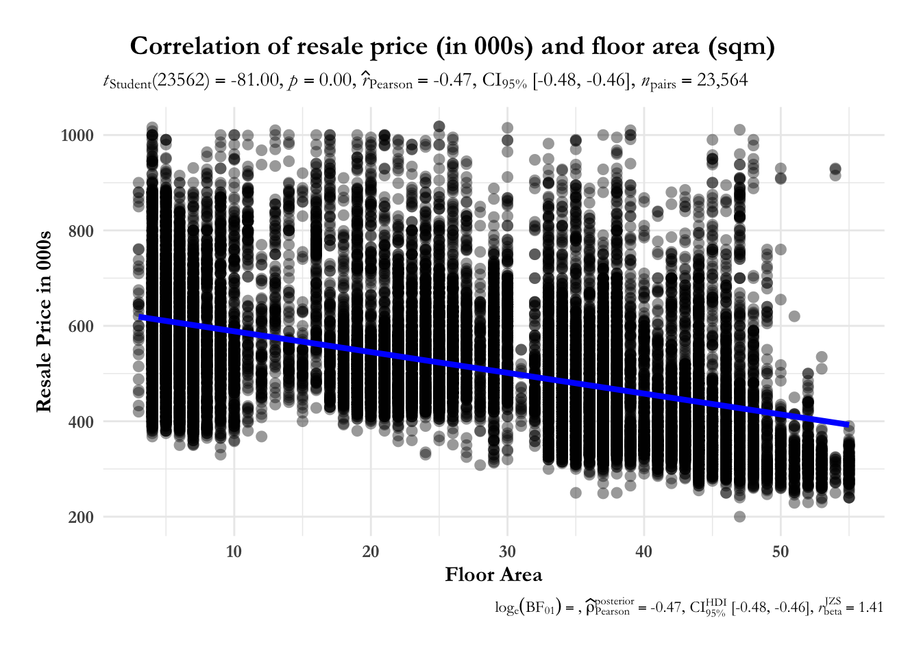
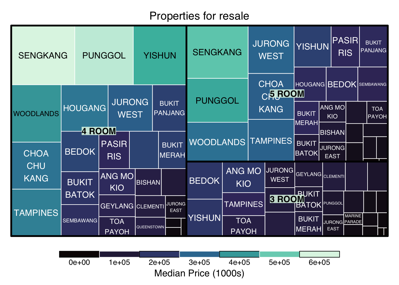
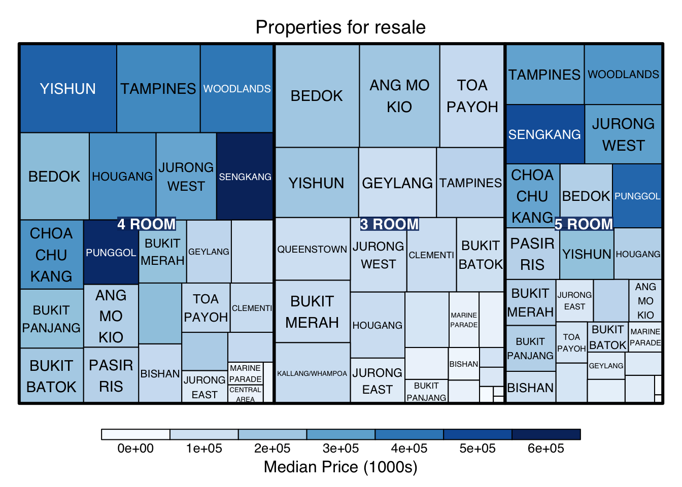
4.2.2 Treemap for Age and Area
Through the treemap, we see on overall glimpse of flat types by prices per square meter and resale prices in 000s across all planning areas.
Code
treemap_area <- treemap (sg_re_price_2022_v1,
        index= c("flat_type", "town"),
        vSize= "floor_area_sqm",
        vColor = "priceK",
        type="manual",
        palette = mako(5),
        border.col = c("black", "white"),
        title="Properties for resale",
        title.legend = "Median Price (1000s)"
        )
Code
treemap_age <- treemap (sg_re_price_2022_v1,
        index= c("flat_type", "town"),
        vSize= "property_age",
        vColor = "priceK",
        type="manual",
        palette = "Blues",
        title="Properties for resale",
        title.legend = "Median Price (1000s)"
        )
5. References
- Dag, Osman, ‘How to remove Outliers from data in R?’, ‘Data Science Team’, March 4, 2022 (link
- White, Kerber, ‘How to Draw a plotly Boxplot in R (Example)’, ‘Statistics Globe’, February, 2022 (link)
- ‘Setting the Font, Title, Legend Entries, and Axis Titles in R’ (link)
- ‘R: ggplot stacked bar chart with counts on y axis but percentage as label’, 2017 (link)
- ‘Ridgeline Plots’, Github (link)
- McLeod, Saul, ‘What does a boxplot tell you?’, ‘Simply Psychology’, 2019 (link)
- Wenyi, Wang, ‘An analysis of Singapore property resale market price based on transaction from 2017 to 2019’, July 17, 2020 (link)
- Qingquan, XIA, ‘Assignment 5’, ‘RPubs’, August, 2020 (link)
- TS Kam, ‘Hands-on Exercise 8: Treemap Visualisation with R’, July, 2019, (link)